Posts Tagged ‘Designs’
Ancient and Modern Graphic Designs
Graphics are the production of visual statements on certain surfaces which may include canvas, paper, walls or pottery amongst others. Sign creations, logos, drawings, symbols, graphs and different forms of geometric designs are all forms of graphics. Coined from the Greek word “Graphikos,” graphics are used in different forms of electronic or print media to represent certain ideas. Graphic design refers to the art of combining different forms of graphics such as texts and pictures in publications, ads and websites. The whole history of art is not complete without the mention of graphic design.
Graphic designs have been used since the medieval era and ancient cultures such as those of Egypt, Greece, France and Australia used graphic art to communicate or record history. Ancient forms of writing and drawing such as those seen in ancient caves and the great Egyptian pyramids form the foundation of graphic art. Graphic art was also illustrated in classical books such as those seen in the gospel books of insular art which depict the animal style of the barbarian peoples of northern Europe.
Modern graphical art was arguably started by William Morris who is considered to be the father of modern graphics. Many graphic designs were produced in his Kelmscott press in the late 19th century and he soon became known for his creativity in this form of art. William Morris together with three other notable artists formed the pre- Raphaelites group and their ideas greatly influenced what is regarded as modern graphic design today.
The advent of computers signaled a new era of graphic design which employed the use of digital techniques and creative styles which can be seen in posters and logos today. Many computer software programs such as Photoshop, Corel draw and windows have been developed with different specialized functions available. Visual artists can produce different designs using computer software without necessarily writing or drawing with a pencil or paintbrush.
Modern designs are used in different print media for advertisements and promotions to pass on a message by a firm or company to a wide range of customers. The famous logo of a renowned soft drink company created by Frank Mason Robinson in 1885 and the Google logo created by Ruth Kedar are forms of graphic designs which are trademarks of companies. Graphic designs are also used on websites to create a visually appealing web page that will attract visitors and prospective customers. Let’s get started and experience some main stream graphical art now!
Friends Link : IPhone G3 Painting Instructional Free Online Advertising American Mailbox soda.iim.bz
Great Price Cotton Tale Designs SGWA for $56.16
Cotton Tale Designs Spring Fling Wall Art, Pink/Blue Review
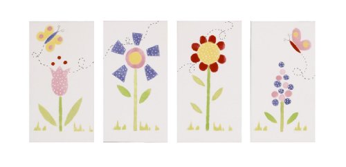
Cotton Tale Designs Spring Fling Wall Art, Pink/Blue Feature
- Essential in making your nursery warm and inviting
- Made using quality materials and are uniquely designed to create your perfect nursery
- This wall art comes in 4 pieces
Cotton Tale Designs Spring Fling Wall Art, Pink/Blue Overview
This wall art comes in 4 pieces. Each piece is 8 x 141/2 with flowers styled on white canvas foam board with ribbon ties. Can be used in sequence or individually. Can be hung as mounted or can be framed. A perfect touch to your nursery.
Available at Amazon Check Price Now!
Related Products
- Cotton Tale Designs Spring Fling Mobile, Pink/Blue
- Cotton Tale Designs Spring Fling 4 Piece Set, Pink/Blue
- Cotton Tale Designs Spring Fling Valance, Pink/Blue
Customer Reviews
*** Product Information and Prices Stored: Feb 12, 2011 18:56:25
See Also : history Book of Art Free Online Advertising Kindle Store eBook Solar power Home Mailbox American Mailbox
Check Out Cotton Tale Designs Wild Elegance Wall Art, Purple Black for $72.00
Cotton Tale Designs Wild Elegance Wall Art, Purple Black Review
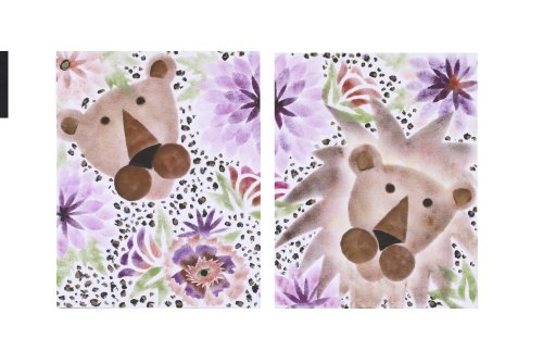
Cotton Tale Designs Wild Elegance Wall Art, Purple Black Feature
- This hand painted diptych can be used together or separately
- This wall art can be hung by ties or framed
- Finest quality materials and are uniquely designed to create an elegant and sophisticated nursery
Cotton Tale Designs Wild Elegance Wall Art, Purple Black Overview
Wall Art
Available at Amazon Check Price Now!
Related Products
- Cotton Tale Designs Wild Elegance 4 Piece Bedding Set, Purple Black
- Cotton Tale Designs Wild Elegance Lamp Shade, Purple Brown
- Cotton Tale Designs Wild Elegance Valance, Cheetah
- Cotton Tale Designs Wild Elegance Pillow Pack, Purple Brown
Customer Reviews
*** Product Information and Prices Stored: Oct 24, 2010 21:24:52
Recommend : Thai Food Good Health history Book of Art Free Online Advertising Home Mailbox American Mailbox
11×17 Poster Printing – Eliminating Slip-Ups in Poster Designs
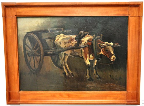
Image : http://www.flickr.com
There is only so much an article on 11×17 poster printing can cover. Nevertheless, here are ways on how you can eliminate horrendous slip-ups in your designs, beyond they are beyond repair.
Let us then ask this question. What makes an 11×17 poster look busy?
1. The amount of details such as a multi-pattern background against a colorful image placed up front can be problematic too. Observe contrast against well defined, solid images and patterns to counter each other off. Proper use of colors is necessary too, as with the next tip.
2. When a poster has too many bright, competing colors, the composition of your poster may become sacrificed. The balance too of your posters may be thrown off in the process because it leaves little room for the audience to focus on the right object.
Unless you can or you are trying to successfully achieve the same effect as that of the work of Vincent Van Gogh or Pollock, then feel free to do so. Just use caution in the number of colors, their intensity and how you use them or else, everything may become too scattered.
3. Too much details, such as text that are quite everywhere. There seems to be nowhere where the text are delegated. These texts seem to pop-up whenever the graphic of the posters has some empty space.
Space is always an important element. It completes the look of the poster. Disruption of it can make your poster look chaotic. It divides the posters where it shouldn’t be. Hence, the text cannot quite grasp the attention of the viewer or reader.
What are some solutions to these problems in your poster design? Before you encounter problems like this, you always have the option to hire a professional graphic designer or you can do the following:
1. Imitate
Imitation may be the best flattery, but it is also one way of learning. You can experience first hand on how to shape your poster in the esteem of your inspiration. Observe how the object surfaces from the background. Observe too the contrast layout, the use of proper details and patterns, and of course colors, contribute to the whole poster design.
Imitation can unlock the secrets to many of the posters you’ve been studying or gawking at. To this, you may be able to imbibe a sense of style or even grasp their own philosophy in design.
2. Color Schemes
Experimenting with colors can be fun. One way, however, to lead you back on the right track is to go back to the fundamentals. Observe the color wheel and complementary, monochromatic colors and of course, color schemes.
Experimenting with colors and color schemes can show you which combination of colors work great together and which ones create medium to high contrasts.
3. Templates
There are templates you can follow when it comes to your poster design and layout. This gives you a versatile number of options on how and where to put the details on your poster.
Templates will show you where to put the headlines, the little details, and how much space you should reserve just for your image or illustrations.
Use some of these ideas on your 11×17 poster printing and design to avoid some mistakes which are just plain hard to re-do again.
Recommend : Kindle Store eBook welcomeholidayservice.com